

Unlock the power of backdrops in visual storytelling
TL;DR:
- Backdrops influence mood, context, and storytelling in photography beyond just aesthetic appeal.
- Selecting the right backdrop involves considering material, size, texture, lighting, and the story intent.
- Professional backdrops enhance workflow, consistency, and emotional impact, elevating overall image quality.
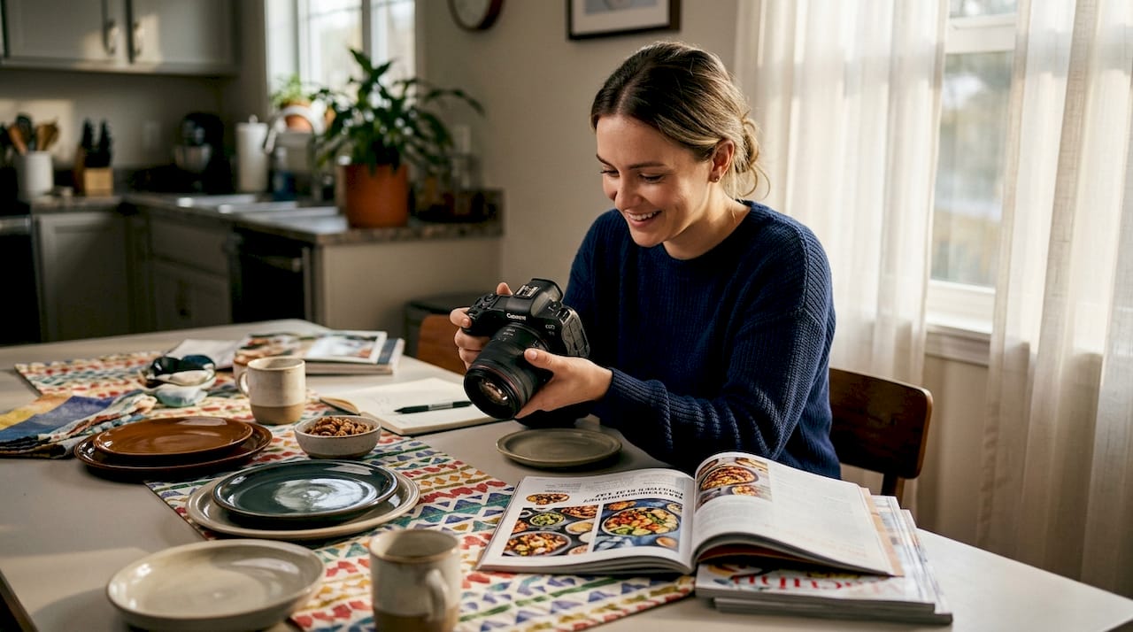
Most photographers spend hours perfecting lighting and composition, then treat the backdrop as an afterthought. That’s a costly oversight. Backdrops don’t just fill empty space behind your subject. They shape mood, establish context, and quietly guide the viewer’s eye toward what matters most. In product photography, backdrops isolate the subject, complement product features through color and texture contrast, and create context for lifestyle shots using materials like marble, wood, or tiles. Whether you shoot food, jewelry, or fashion, your backdrop is doing more storytelling work than you might realize.
Table of Contents
- Why backdrops matter: More than just a background
- The mechanics of selecting and using the right backdrops
- Navigating pitfalls: Common mistakes and how to avoid them
- Amplifying storytelling: Creative backdrop strategies for pros
- From inspiration to execution: Applying backdrop principles in real shoots
- What most experts overlook about backdrop storytelling
- Upgrade your storytelling with professional backdrops
- Frequently asked questions
Key Takeaways
| Point | Details |
|---|---|
| Backdrops shape narrative | The right backdrop elevates subject focus and instantly establishes context in photos. |
| Material and color matter | Matching the background’s texture and tone to your subject dramatically boosts visual storytelling. |
| Avoid common pitfalls | Glossy surfaces and busy patterns undermine the story—select matte, neutral backgrounds for reliability. |
| Test for your scenario | Always preview your setup with subject and lighting before the final shoot for the best results. |
Why backdrops matter: More than just a background
A backdrop frames your subject before a single light is switched on. It tells the viewer where to look, what to feel, and what story they’re stepping into. That’s a lot of responsibility for something most people treat as a neutral surface.
The role of backdrops in product photography goes well beyond aesthetics. A clean white surface communicates clinical precision. A warm, aged wood grain suggests artisanal quality. A cool marble texture signals luxury. These associations happen instantly, often before the viewer consciously registers the background at all.
“Backdrops isolate the subject, complement product features, and create context for lifestyle shots using materials like marble, wood, or tiles.”
Textured backgrounds add visual depth and tactile interest. Plain, seamless backgrounds keep the focus sharp on the product itself. Neither is universally better. The right choice depends entirely on what you’re communicating.
Here’s how backdrops influence perception and brand story:
- Subject isolation: A contrasting backdrop separates your product from the background, making it visually pop without heavy post-processing.
- Mood setting: Warm tones create comfort and approachability. Cool tones suggest precision or elegance.
- Brand alignment: Consistent backdrop choices across a product catalog build a recognizable visual identity.
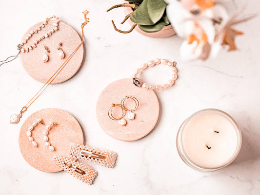
- Context creation: Textured or themed backdrops place a product in a lifestyle scenario, helping buyers imagine it in their own lives.
- Narrative layering: Symbolic backgrounds add a secondary layer of meaning that supports your overall story.
When you start thinking of your backdrop as a storytelling tool rather than a background prop, your images immediately become more intentional and more powerful.
The mechanics of selecting and using the right backdrops
Choosing a backdrop isn’t just about picking something that looks nice. It’s a technical decision that affects lighting, composition, and the final emotional impact of your image. Understanding the photography background types available to you is the first practical step.
| Material | Best use cases | Key advantage |
|---|---|---|
| Vinyl | Product, food, flat lay | Durable, spill-proof, high-resolution print |
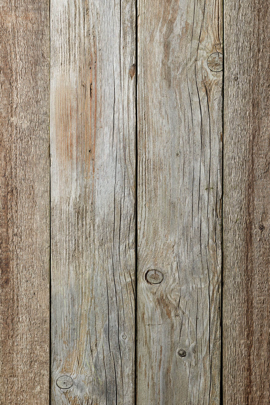
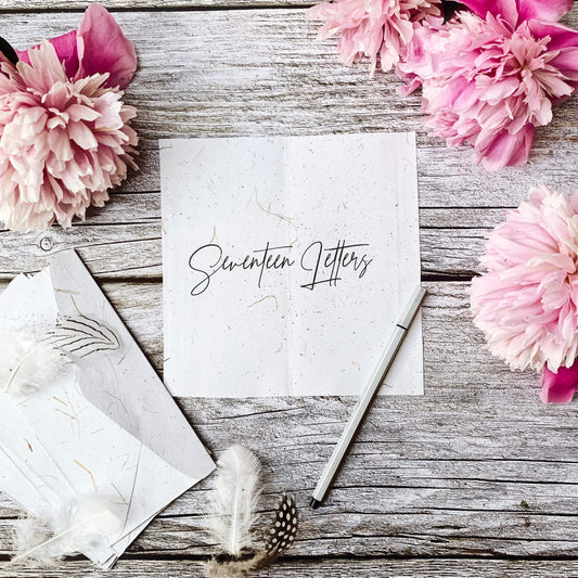
| Wood boards | Lifestyle, artisan products | Natural texture, warm tones |
| Fabric | Portrait, fashion | Soft, draped look |
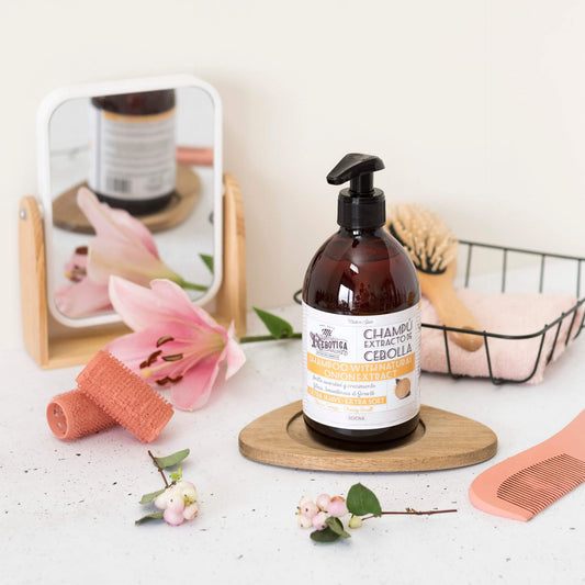
| Marble tile | Jewelry, cosmetics, food | Luxury feel, easy to clean |
As a practical guide to choosing the right backdrop, follow these steps:
- Define your subject’s dominant color. Identify whether you need contrast or harmony with the backdrop.
- Clarify your shot intent. Is this a clean product shot, a lifestyle scene, or a flat lay? Each calls for a different approach.
- Consider your light source. Natural light behaves differently on matte versus glossy surfaces.
- Check your shooting angle. A 2x2 ft board works for overhead flat lays, but angled shots need more surface area.
- Test before committing. Shoot a few test frames with your product before locking in your setup.
The best backdrop options for most professional setups balance versatility with visual impact. According to material experts, matching backdrop color and texture to your subject using complementary or analogous tones, controlling lighting interaction, and sizing for your shooting angle are the three pillars of smart backdrop selection.
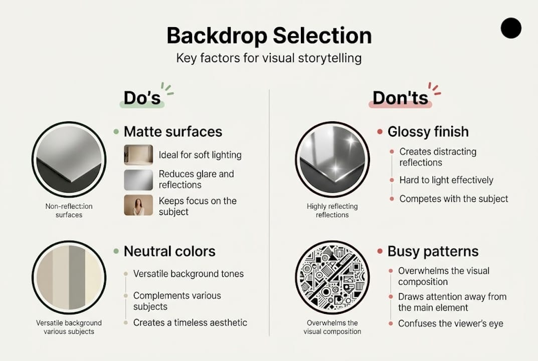
Pro Tip: Always choose matte backdrops when shooting under studio lights or near windows. Glossy surfaces catch reflections and create distracting hotspots that are difficult to remove in post-processing.
Navigating pitfalls: Common mistakes and how to avoid them
Even experienced photographers fall into predictable backdrop traps. Knowing what to avoid saves you time, reshoots, and frustration. Use this vinyl backdrop checklist as your go-to reference before any shoot.
Here are the top five mistakes to avoid:
- Using busy patterns for product shots. Busy patterns distract the viewer’s eye and compete with the subject. Save bold patterns for editorial or fashion work where the backdrop is part of the concept.
- Choosing glossy materials. Glossy surfaces reflect light unevenly and create glare that flattens the image. Matte finishes give you consistent, controllable results.
- Using a backdrop that’s too small. A small backdrop limits your framing options and can show edges or shadows at the corners of your shot.
- Ignoring texture direction. Wood grain or stone textures have a visual flow. Orienting them incorrectly can feel jarring or unnatural to the viewer.
- Skipping a test shot. Colors look different under artificial light than they do on a screen. Always test your backdrop with your actual subject and light setup.
Composition falls apart quickly when any of these errors creep in. A busy background pulls focus. A glossy surface adds noise. A too-small backdrop forces awkward cropping.
Pro Tip: If you’re shooting near a window, use a sheer diffusion panel or white curtain to soften direct sunlight. Harsh, direct light creates uneven shadows on textured backdrops and makes colors appear inconsistent across the frame.
Amplifying storytelling: Creative backdrop strategies for pros
Once you’ve mastered the basics, it’s time to use backdrops with real creative intention. Themed photography backdrop tips can help you build a more layered, emotionally resonant image.
The emotional weight of a backdrop tone is real and measurable:
| Backdrop tone | Mood conveyed | Best suited for |
|---|---|---|
| Dark, moody | Drama, luxury, intensity | Fine dining, spirits, high-end fashion |
| Bright, clean | Energy, freshness, clarity | Health products, citrus foods, activewear |
| Neutral, warm | Comfort, approachability | Artisan goods, baked goods, lifestyle |
| Textured, aged | Authenticity, heritage | Craft products, vintage, rustic food |
“Backdrops evolve with the story: darker tones build drama, bright tones inject energy, and symbolic backgrounds add hidden meaning that deepens the viewer’s emotional response.”
Symbolism is one of the most underused tools in backdrop selection. A cracked concrete surface behind a skincare product tells a story about resilience and transformation. A lush green moss background next to a tea brand communicates natural origins without a single word of copy.
Think about what your backdrop is saying when your subject isn’t speaking. The most powerful images use every element, including the background, to reinforce a single, clear message. When your backdrop and subject are aligned in tone and meaning, the image feels cohesive and intentional rather than assembled.
From inspiration to execution: Applying backdrop principles in real shoots
Knowing the theory is one thing. Applying it under real shoot conditions is another. Here’s how to build a storytelling composition from the ground up, whether you’re working on food backdrop setups or exploring backdrop ideas for pros.
- Start with your story. Before selecting any backdrop, ask: what feeling should this image leave the viewer with?
- Choose your primary backdrop. Based on your subject color and story intent, select a matte textured surface as your base.
- Add foreground elements. Props, food items, or product accessories layer in context without overwhelming the frame.
- Set your light. Position your light source to complement the backdrop texture. Side lighting enhances depth on wood or stone surfaces.
- Shoot a test frame. Review the full composition before committing to your final setup.
- Adjust and iterate. Swap backdrops, shift angles, and try different foreground arrangements until the image tells the right story.
Neutral matte textures like wood and marble are the most versatile starting points for product, food, and lifestyle shoots. They work across a wide range of product colors and lighting setups without requiring significant adjustments between sessions.
Pro Tip: Invest in double-sided backdrop boards. One board gives you two distinct looks, which cuts setup time significantly when you’re shooting multiple products in a single session. It’s a small investment that pays off every time you need to pivot quickly between styles.
For DIY setups, crumpled kraft paper and ceramic tiles can work for occasional shoots. But for consistent, professional results across a product catalog, purpose-built vinyl backdrops deliver the reliability and visual quality that ad-hoc solutions simply can’t match.
What most experts overlook about backdrop storytelling
Here’s something worth sitting with: the photography community has developed a strong bias toward minimalism. Clean, simple, white or gray backdrops dominate tutorials and inspiration feeds. And while minimalism has real value, it’s often chosen out of habit rather than intention.
The truth is, a perfectly safe backdrop can also be a perfectly forgettable one. When every image in your catalog uses the same neutral gray surface, the story stops evolving. The viewer stops feeling anything.
Controlled contextual detail, meaning a backdrop with just enough texture or tonal variation to suggest a real environment, often creates more emotional engagement than pure minimalism. It’s not about clutter. It’s about believability. Realistic backdrops for product photos create a sense of place that pulls the viewer in rather than keeping them at arm’s length.
Also worth noting: small backdrop changes across a photo series can carry a subtle narrative. Shifting from a light oak tone to a darker walnut across a product line communicates evolution, depth, and variety without changing anything else in the frame. Let the story dictate your backdrop choice, not the trend.
Upgrade your storytelling with professional backdrops
If you’ve been relying on makeshift surfaces or outdated setups, now is the right time to rethink your toolkit. Professional-quality backdrops simplify your workflow, reduce editing time, and give every image a polished, consistent foundation that clients and audiences notice immediately.
At Instant Backdrops, we offer a curated range of vinyl backdrops designed for exactly the kind of intentional visual storytelling covered in this article. From marble and wood to stone and decorative walls, every backdrop is printed in high resolution, spill-proof, and built to hold up through real professional use. If you’re ready to find your ideal backdrop, our selection guide makes it easy to match the right surface to your subject, style, and story.
Frequently asked questions
What is the most versatile backdrop color for storytelling?
Neutral matte shades such as gray, beige, and wood grain are versatile for both product and food photography, complementing most subjects without distraction.
How do I prevent glare in my backdrop photos?
Choose matte material backdrops and position lighting at angles that minimize direct reflection. Matte surfaces avoid glare and give you consistent, controllable results across different lighting setups.
How can backdrops convey mood or emotion in a photo?
By altering color, tone, and texture, backdrops can signal drama, energy, or calm. Darker tones build drama while bright tones inject energy, and symbolic backgrounds add meaning that deepens the viewer’s emotional response.
What size backdrop should I use for flat lays?
A 2x2 ft backdrop is usually ideal for flat lay compositions. Larger sizes suit angled or portrait shots where more surface area is needed to fill the frame.
Can I use the same backdrop for both product and lifestyle shoots?
Yes. Neutral and textured backdrops like wood or marble are often suitable for a range of photography types, provided you adapt your lighting and scene context to match the shoot’s intent.